
The Elements That Drive Conversions
Breaks down the core components every high-performing page needs—from headlines that hook to CTAs that convert. We’ve analyzed what works across 200+ Canadian landing pages.
Read moreYour page isn’t a brochure—it’s a conversation. Learn how to guide visitors through a clear narrative that builds trust and moves them toward action.

Most landing pages fail because they’re trying to do everything at once. They throw features, benefits, and calls-to-action everywhere and hope something sticks. But that’s not how people actually read pages.
When you visit a landing page, you’re not reading it like a book. You’re scanning. You’re looking for a reason to care, a reason to keep scrolling, and most importantly—a reason to take the next step. That reason comes from story.
A well-designed page doesn’t just present information. It guides you through a journey. It starts with a problem you recognize, shows you how that problem gets solved, and ends with a clear next step. That’s narrative design, and it’s what separates pages that convert from pages that get bounced.

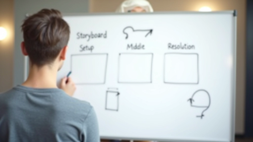
Think of your landing page like a film. It’s got three acts, and each one has a job to do.
Your hero section needs to show visitors they’re in the right place. This isn’t where you sell. It’s where you connect. Show the problem. Make them nod and think “yeah, that’s me.” You’ve got maybe 3 seconds here—make them count.
Once you’ve got their attention, you build. Show how the problem gets solved. Walk through the process. Use real examples. Show what success looks like. This is where trust develops—through clarity, not through hype. Most conversions happen here because readers finally understand the value.
End strong with a clear call-to-action. By this point, they’ve seen the problem, understood the solution, and know why it matters. Your CTA just needs to remove friction. Make it obvious what happens next. Make it feel like the natural conclusion to the story you’ve been telling.
Story doesn’t live in words alone. It lives in how your page is designed. The layout, the images, the spacing—they all communicate a narrative arc.
Here’s what we see work consistently: Start narrow. Your hero section should be tight and focused. One clear message. Then expand. As you move down the page, introduce more information, more examples, more depth. Then narrow again at the end with your CTA.
This visual rhythm mirrors storytelling. You’re pulling people in, giving them substance, then giving them a clear endpoint. Images should support this too—they’re not decoration. They’re part of the story. Show real people, real situations, real before-and-after moments.
“The best landing pages don’t feel like sales pages. They feel like someone’s genuinely trying to help you solve a problem.”
These aren’t nice-to-haves. They’re the building blocks of narrative design.
Your headline isn’t a feature list. It’s the opening line of a conversation. It names the problem or promise in a way that makes someone want to read the next sentence. “Get more leads” is weak. “How to turn your website into a lead generation machine” pulls people in.
Stock photos of people high-fiving don’t tell a story. Real images do. Show your actual product being used. Show actual results. Show the transformation. When visitors see someone like them getting real results, it becomes credible. It becomes their story.
Testimonials work best when they’re specific stories, not generic praise. “This changed my business” is nice. “Our conversion rate jumped from 2.1% to 3.8% in 6 weeks” is a story. It’s concrete. It’s believable. It shows real transformation.
Don’t make visitors guess what happens next. The best CTAs feel like the natural conclusion to the story you’ve been telling. It shouldn’t feel like a sales move. It should feel like you’re inviting them to continue the journey.
Cramped pages feel frantic. White space (or dark space on dark backgrounds) is part of the story. It gives readers time to digest. It builds anticipation. It shows respect for the visitor’s attention. Good pacing is good storytelling.
Readers should know where to look and in what order. Big headlines pull attention first. Supporting text fills in details. CTAs stand out. When hierarchy is clear, the story unfolds naturally. When it’s muddled, visitors get lost.
Here’s what we actually look for when we’re reviewing a page to see if it’s telling a story effectively:
If you can answer “yes” to most of these, you’re building story. If you’re getting “no” or “maybe,” go back and look for where the narrative breaks down.

Every landing page tells a story. The question is whether you’re telling it intentionally or by accident.
When you design with narrative in mind, visitors don’t feel sold to—they feel guided. They move from awareness to understanding to action naturally. There’s no friction because every element is reinforcing the same story.
The pages that convert best aren’t the flashiest. They’re the ones that feel like someone genuinely understands the visitor’s situation and is showing them a clear path forward. That’s storytelling. And it works.
Start looking at your pages not as collections of sections, but as narratives. Where does the story start? Where does it build? Where does it resolve? Once you see your page that way, you’ll know exactly what to fix.


This article is educational and informational in nature. It’s meant to help you understand principles of effective landing page design and narrative structure. Results vary depending on your specific industry, audience, target market, and implementation. We recommend testing these concepts with your own audience and consulting with experienced conversion rate optimization specialists before making major changes to your pages. What works for one business may not work identically for another—context matters.